Overview
Back in 2016, I was on the hunt for a motorcycle and came across the Vulcan ABS Cafe from Kawasaki. To learn more about the model, I decided to visit their website.
As I explored the website, I noticed a few areas where the user experience and design could be improved. Although the initial design was decent, I saw opportunities to make marginal enhancements that would provide a better user experience.
While I had some ideas on how to improve the website, I knew it was important to gather real data to validate my ideas and uncover any potential issues that I may have missed. Therefore, conducting user research was necessary to obtain reliable data to support my ideas and create an overall better experience.
I don't usually do redesigns. This is the only one I've ever made.
Please note: I did not work for Kawasaki. Unlike the designers who work there, I don't have access to the user data that influenced their current design. As a result, the views from this case study are strictly my own.
My contribution
This was supposed to be a personal development exercise that would improve my user research/data analysis, and product design skills.
The research
I started by defining the research objective and questions I had. The objective was simple to improve the user experience of the product presentation page. I could not set objectives such as increased conversion because I would not be able to implement and test the changes.
Some of the question I have included:
- What information do users need when looking at the product presentation page?
- What visual elements and design elements should be included to enhance the user experience?
- What are the pain points and challenges users face when browsing this page?
- What can be done to improve the overall user experience of the page?
My target audience were people who are motorcycle enthusiasts, have experience purchasing motorcycles, and have used motorcycle presentation pages before.
Research methods of choice:
- Remote usability testing to observe users' behavior and gather feedback on the current product presentation page.
- Interviews to discuss pain points and challenges, and generate ideas for improvement.
The testing plan had participants complete a series of tasks that reflect real-life scenarios of looking for information on the motorcycle presentation page. I asked them to think out loud while performing tasks to gather insights into their thought process and experience.
Among the 11 people I interviewed, there were 9 males and 2 females. The age of the male users ranged from 26 to 39 years old, while the female users ranged from 29 to 32 years old. All have a stable income and are part of a middle-class family. All the men have ridden motorcycles before and/or own(ed) one. All were acquaintances.
Before doing the interviews I also did a heuristic review and took notes. After interviewing the users, I gathered and synthesized data to identify patterns, trends, and common pain points. I also compared my review with interview notes to validate my findings.
I found these potential problems:
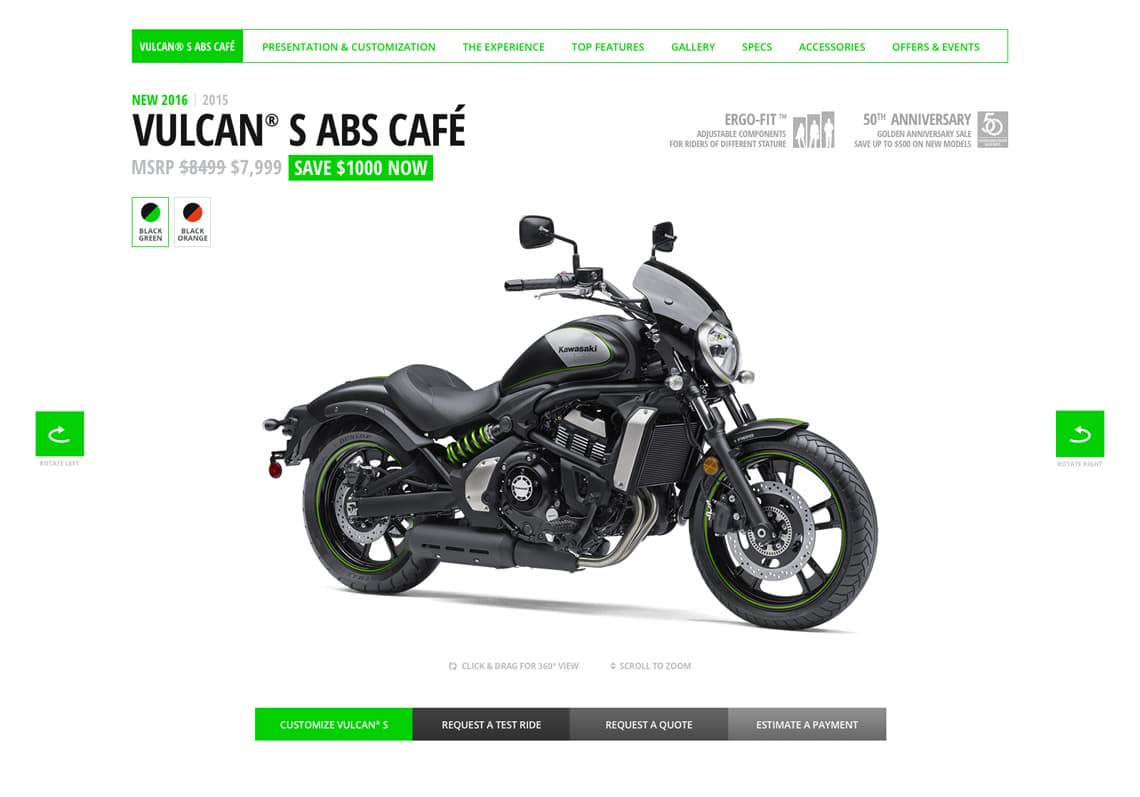
- Header:
- Crowded header. Hard to find any information.
- Lackluster zoom-in feature for the bike photos.
- 360-degrees view button not obvious. People were just not able to find it.
- No way to take a good look at the motorcycle.
- Vehicle experience:
- Content hard to find. Buttons not obvious.
- Missing navigational elements (arrows, pagination dots, etc.)
- Top features:
- Navigational arrows are not prominent enough
- Gallery:
- No clear distinction between video and photo thumbnails
- Accessories & Apparel:
- Title & disclaimer suggest apparel but only motorcycle accessories are shown
Below, I explain how I solved some of the problems mentioned above and also talk about what happened during the interviews.
The work
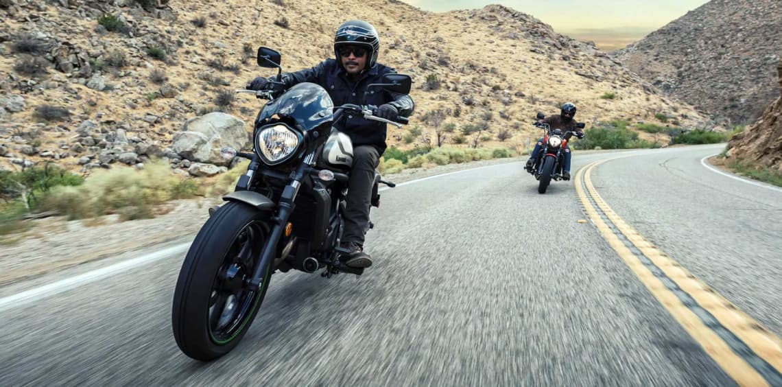
One of the biggest issues that most people faced was not being able to get a good look at the motorcycle without having to jump through hoops. The presentation image in the header was small and blurry. The zoom-in feature was not much help either because it only displayed a part of the motorcycle and that too from only one side. Most people wanted to view the motorcycle from both sides.
As a result, users scrolled down the page and stopped at the gallery to view photos from different angles. Only a few users attempted to find an alternate view in the header, and of those who stayed, only two saw and clicked on the 360-degrees vehicle presentation button (we'll discuss why they missed the button shortly).
Although the 360-degrees button was visible, it was not very obvious. Initially, I wanted to redesign the buttons and the zoom-in feature. However, given the new data, I knew I had to take things even further. I decided to make the 360 view functionality the main attraction of the header and pushed aside all the content that was fighting for attention.
The motorcycle customizer, which was located at the bottom of the page, allowed users to add accessories to the motorcycle and see a (very small) preview in real-time. With the new 360-degrees view in place, I had a great showcase for the motorcycle, so I decided to merge both features together. This would enhance the customizer and give it more importance, allowing users to view the motorcycle from whichever angle they wanted and also customize it without having to scroll to another section.
The customizer had some limitations in terms of the preview of the motorcycle as it only allowed users to see the customized motorcycle from two angles. However, we could easily turn the bike to those angles and restrict movement while the customizer was active. Merging the two components could be done using existing technologies with no additional photos or resources. This decision was not solely based on research, but also a personal choice to enhance the user experience.
Crowded Earlier, I mentioned that many people missed the 360-degree view button on the original page. The header was chock-full of information. All the buttons had the same visual weight, even though they didn't have the same level of importance. There was very little visual distinction between them, and in some cases, it wasn't even clear that they were actual buttons. The text around them used an all-caps/bold condensed font, making everything look very crowded, which was a problem.
To address this issue, I removed all the unnecessary information and pushed it aside, giving it less importance through color, opacity, or position. I redesigned the buttons to make them more noticeable, while also adding a bit of visual interest. I added some white space to make everything clearer and easier to understand.
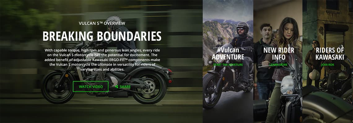
Hidden content The research suggested the "Vehicle experience" section had a few problems as well. Dark buttons over a dark background with no other elements (arrows, pagination dots) that suggest there is more content to be discovered meant users were going to miss it. None of was critical but it needed to be discovered with a little less effort.
To be honest, I was a bit surprised by this conclusion since I personally did not have any trouble figuring out where the buttons were and what they did.
Miscellaneous
I made several other small improvements that were more of a matter of personal taste but I think all were beneficial and all helped in defining the new look.
I removed some design elements that didn't fit at all with either the previous or current design (see image below). The black noise texture had to go. I replaced it with a dark, almost black, full color.
Marginal gains
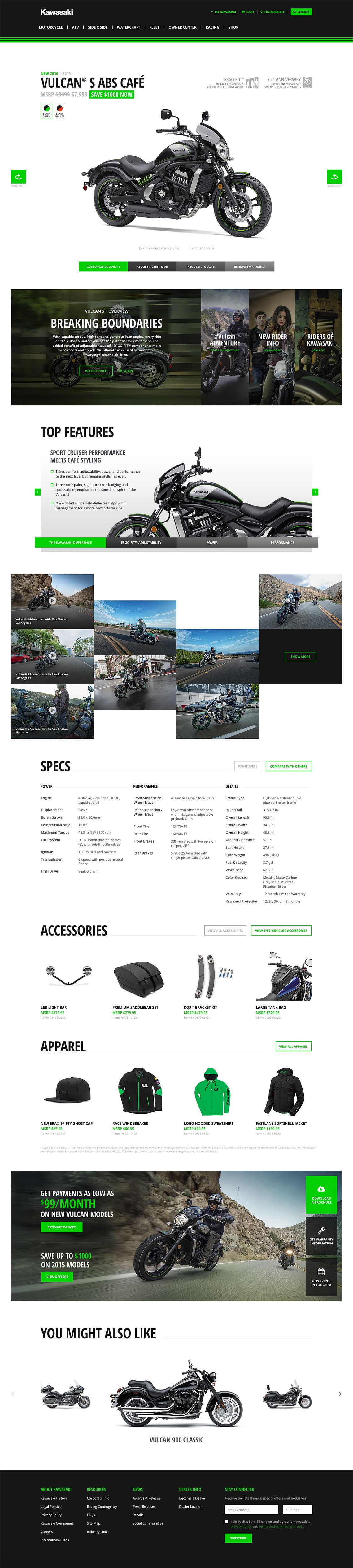
Here is what the final hi-fidelity mockup looks like:
All the changes I made improve the overall user experience while retaining all the branding elements and its initial structure. I designed this page taking into consideration that it's actually a modular template used to present almost every vehicle on Kawasaki.com. I strongly believe it can serve this purpose just as well as the original while adding a few improvements to the table.
Disclaimer: All trademarks, registered trademarks, logos, images and copyrights are the property of their respective owners.